This tutorial project (see ./examples/datastore_statistics_2d/) explains several advanced functions of JKQTPDatastore in combination with the [JKQTPlotter Statistics Library] conatined in JKQTPlotter.
Note that there are additional tutorial explaining other aspects of data mangement in JKQTPDatastore:
The source code of the main application can be found in datastore_statistics_2d.cpp. This tutorial cites only parts of this code to demonstrate different ways of working with data for the graphs.
Generating different sets of random numbers
The code segments below will fill different instances of JKQTPlotter with different statistical plots. All these plots are based on either of two sets of random number pairs (i.e. x/y-locations) generated as shown here:
size_t randomdatacolx_small=datastore1->addColumn("random data, x");
size_t randomdatacoly_small=datastore1->addColumn("random data, y");
size_t randomdatacoldist_small=datastore1->addColumn("random data, distribution/class");
size_t randomdatacolx=datastore1->addColumn("random data, x");
size_t randomdatacoly=datastore1->addColumn("random data, y");
size_t randomdatacoldist=datastore1->addColumn("random data, distribution/class");
std::random_device rd;
std::mt19937 gen{rd()};
std::uniform_int_distribution<> ddecide(0,2);
std::normal_distribution<> d1x{5,3};
std::normal_distribution<> d1y{5,1};
std::normal_distribution<> d2x{10,2};
std::normal_distribution<> d2y{10,5};
for (size_t i=0; i<500; i++) {
double rx=0,ry=0;
const int decide=ddecide(gen);
if (decide==0) {
rx=d1x(gen);
ry=d1y(gen);
} else {
rx=d2x(gen);
ry=d2y(gen);
}
if (i<150) {
datastore1->appendToColumn(randomdatacolx_small, rx);
datastore1->appendToColumn(randomdatacoly_small, ry);
datastore1->appendToColumn(randomdatacoldist_small, std::min(1,decide));
}
datastore1->appendToColumn(randomdatacolx, rx);
datastore1->appendToColumn(randomdatacoly, ry);
datastore1->appendToColumn(randomdatacoldist, std::min(1,decide));
}
The columns randomdatacolx and randomdatacoly will contain 500 random numbers. Each one is drawn either from the normal distributions d1x/d1y, or d2x/d2y. The decision, which of the two to use is based on the result of a third random distribution ddecide, which only returns 0, 1 or 2 (d1x/d1y is chosen for ddecide==0). The column randomdatacoldist finally encodes which pair of distributions was chosen. The three columns randomdatacolx_small, randomdatacoly_small and randomdatacoldist_small represent a subset of the first 150 numbers from the full dataset. The columns are generated empty by calling JKQTPDatastore::addColumn() with only a name. Then the actual values are added by calling JKQTPDatastore::appendToColumn().
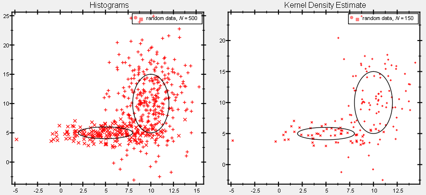
The datasets generated above can be plotted using a simple scatterplot (here shown for the full dataset only):
QMap<double, JKQTPGraphSymbols> mapped;
gDataHist->
setTitle(QString(
"random data, $N="+QString::number(datastore1->getRows(randomdatacoldist))+
"$"));
void setSymbolSize(double __value)
set the size (=diameter in pt) of the graph symbol (in pt)
void setSymbolColor(const QColor &__value)
set the color of the graph symbols
virtual void setTitle(const QString &__value)
sets the title of the plot (for display in key!).
void setXYColumns(size_t xCol, size_t yCol)
sets xColumn and yColumn at the same time
This implements xy scatter plots (like JKQTPXYScatterGraph), but the color and size of the symbols ma...
Definition jkqtpscatter.h:147
void setDrawLine(bool __value)
indicates whether to draw a line or not
void setSymbolColumn(int __value)
this column contains the symbol type
void setMappedSymbolColumnFunctor(const QMap< double, JKQTPGraphSymbols > &symmap)
defines a special functor, which converts a value from the symbolColumn into an actual symbol type,...
QColor QColorWithAlphaF(const QColor &color, qreal alphaF)
construct a QColor, based on the given color, but with alpha set to the specified value alphaF
Definition jkqtptools.h:364
In addition to get an idea of the used distributions, we can add two ellipses indicating the (doubled) standard deviations of the two distributions:
plothist->addGraph(gEll1Hist=
new JKQTPGeoEllipse(plothist, d1x.mean(), d1y.mean(),d1x.stddev()*2.0,d1y.stddev()*2.0));
plothist->addGraph(gEll2Hist=
new JKQTPGeoEllipse(plothist, d2x.mean(), d2y.mean(),d2x.stddev()*2.0,d2y.stddev()*2.0));
This JKQTPGeometricPlotElement is used to draw an ellipse.
Definition jkqtpgeoshapes.h:300
The resulting plot looks like this:
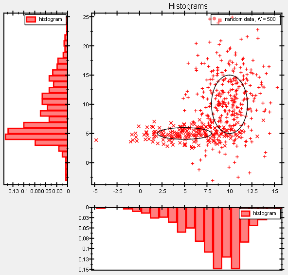
Marginal Statistics
To explore the statistical properties of a 2D dataset, it is often useful to draw the marginal histograms, i.e. the histograms of one of the two variables. To do so, we use the function jkqtpstatAddHHistogram1DAutoranged() and jkqtpstatAddVHistogram1DAutoranged() that were introduced in Advanced 1-Dimensional Statistics with JKQTPDatastore and are explained in detail there:
Note that the plots are put into JKQTPlotter-instances plothistBottom and plothistLeft. These are put into a global QGridSizer just below and left of the main histogram plot plothist. The axes of these plots are linked to the main plot, so zooming one affects the other plot too and their axes are inverted, so the drawn histogram elongates to the left and to the bottom (starting with 0 at the main plot plothist):
QGridLayout* lay;
lay->addWidget(plothist,0,1);
lay->addWidget(plothistLeft,0,0);
lay->addWidget(plothistBottom,1,1);
void setPlotLabel(const QString &__value)
set the plot label text
void setDrawMode2(JKQTPCADrawMode __value)
draw mode of the secondary (right/top) axis
void setShowZeroAxis(bool __value)
indicates whether to draw a thick axis line at x=0 (zero axis)
void setDrawMode1(JKQTPCADrawMode __value)
draw mode of the main (left/bottom) axis
void setInverted(bool __value)
indicates whether the axis is to be inverted or not
This class manages data columns (with entries of type double ), used by JKQTPlotter/JKQTBasePlotter t...
Definition jkqtpdatastorage.h:282
plotter widget for scientific plots (uses JKQTBasePlotter to do the actual drawing)
Definition jkqtplotter.h:374
void synchronizeYToMaster(JKQTPlotter *master, bool synchronizeAxisLength=true, bool synchronizeZoomingMasterToSlave=true, bool synchronizeZoomingSlaveToMaster=true)
synchronize the plot y-axis height (and y-zooming) with a given master plotter (master --> slave/this...
JKQTPVerticalAxisBase * getYAxis(JKQTPCoordinateAxisRef axis=JKQTPPrimaryAxis)
returns the y-axis objet of the plot
Definition jkqtplotter.h:725
void setAbsoluteX(double xminn, double xmaxx)
sets absolutely limiting x-range of the plot
Definition jkqtplotter.h:1164
JKQTBasePlotter * getPlotter()
returns the JKQTBasePlotter object internally used for plotting
Definition jkqtplotter.h:414
void setGrid(bool val)
sets whether the major grid lines of the major axes are shown
Definition jkqtplotter.h:942
void setMousePositionShown(bool __value)
specifies whether to display the current position of the mouse in the top border of the plot (this ma...
void synchronizeXToMaster(JKQTPlotter *master, bool synchronizeAxisLength=true, bool synchronizeZoomingMasterToSlave=true, bool synchronizeZoomingSlaveToMaster=true)
synchronize the plot x-axis width (and x-zooming) with a given master plotter (master --> slave/this)
void setAbsoluteY(double yminn, double ymaxx)
sets absolute minimum and maximum y-value to plot
Definition jkqtplotter.h:1167
JKQTPDatastore * getDatastore()
returns a pointer to the datastore used by this object
Definition jkqtplotter.h:621
JKQTPHorizontalAxisBase * getXAxis(JKQTPCoordinateAxisRef axis=JKQTPPrimaryAxis)
returns the x-axis objet of the plot
Definition jkqtplotter.h:723
@ JKQTPCADMLine
draw axis as thick line
Definition jkqtptools.h:403
@ JKQTPCADMLineTicks
draw axis with ticks and line
Definition jkqtptools.h:414
This results in a graph like this:
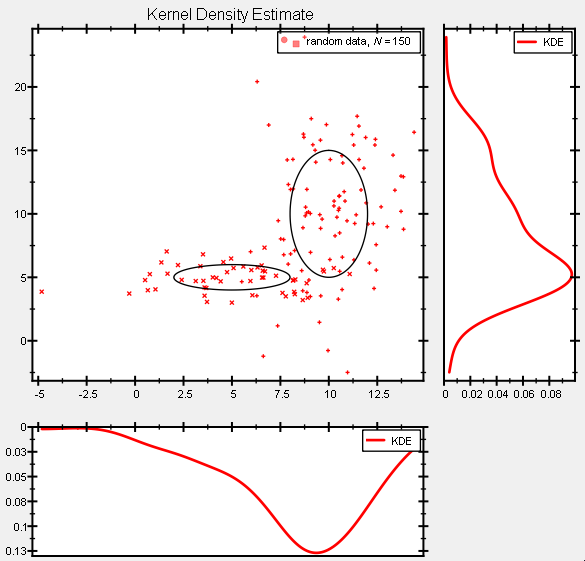
With the same method, also marginal Kernel Density Estimates can be drawn:
ColumnIterator begin()
returns an iterator to the first column in the JKQTPDatastore
ColumnIterator end()
returns an iterator behind the last column in the JKQTPDatastore
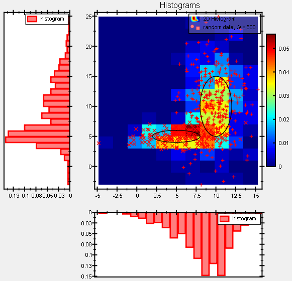
2D Histogram
Calculating 2D-Histograms is implemented in jkqtpstatHistogram2D() from the JKQTPlotter Statistics Library. This functions calculates a histogram on a given grid with the first bin at xmin,ymin and the last bin at xmax,ymax, containing Nx,Ny bins in x-/y-direction. You can use the result to fill new image column (with Nx columns and Ny rows) in a JKQTPDatastore, which can then be used to draw the histogram.
First we have to determine the x- and y-range of data and calculate the number of bins from these:
double xmin=0, xmax=0;
double ymin=0, ymax=0;
size_t Nx=jkqtp_ceilTo<size_t>((xmax-xmin)/2.0);
size_t Ny=jkqtp_ceilTo<size_t>((ymax-ymin)/2.0);
Now we can add the image column
size_t addImageColumn(size_t width, size_t height, const QString &name=QString(""))
add a new columns with width * height rows to the datastore and return its column ID....
and calculate the histogram:
datastore1->
begin(histcol),
xmin, xmax, ymin, ymax,
Nx, Ny, true);
Finally the histogram is drawn using a JKQTPColumnMathImage:
class to plot an image from an 2-dimensional array of values stored in a column of the datastore
Definition jkqtpimage.h:771
virtual void setImageColumn(int __value)
column containing the displayed image
void setHeight(double __value)
height of image
void setX(double __value)
x coordinate of lower left corner
void setWidth(double __value)
width of image
void setY(double __value)
y coordinate of lower left corner
virtual void setTitle(const QString &title) override
sets the title of the plot (for display in key!).
size_t addGraph(JKQTPPlotElement *gr)
Definition jkqtplotter.h:796
The resulting image plot looks like this:
There is also an "adaptor" which significanty reduce the amount of coude you have to type (i.e. it replaces all the code above):
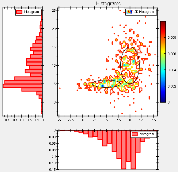
These differ in the type of plot that is added jkqtpstatAddHistogram2DImage() adds an image graph (JKQTPColumnMathImage) and jkqtpstatAddHistogram2DContour() adds a contour plot (JKQTPColumnContourPlot). A contour plot may look like this:
Kernel Density Estimates (KDE)
Especially when only few samples from a distribution are available, histograms are not good at representing the underlying data distribution. In such cases, Kernel Density Estimates (KDE) can help, which are basically a smoothed variant of a histogram. The JKQTPlotter Statistics Library supports calculating them via e.g. jkqtpstatKDE2D():
This functions calculates a histogram on a given grid with the first bin at xmin,ymin and the last bin at xmax,ymax, containing Nx,Ny bins in x-/y-direction. You can use the result to fill new image column (with Nx columns and Ny rows) in a JKQTPDatastore, which can then be used to draw the histogram.
First we have to determine the x- and y-range of data and calculate the number of bins from these:
double xmin=0, xmax=0;
double ymin=0, ymax=0;
Nx=jkqtp_ceilTo<size_t>((xmax-xmin)/0.1);
Ny=jkqtp_ceilTo<size_t>((ymax-ymin)/0.1);
We can also estimate the KDE-bandwidth for both directions now:
Now we can add the image column
and calculate the histogram:
jkqtpstatKDE2D(datastore1->
begin(randomdatacolx_small), datastore1->
end(randomdatacolx_small), datastore1->
begin(randomdatacoly_small), datastore1->
end(randomdatacoly_small),
datastore1->
begin(kdecol),
xmin, xmax, ymin, ymax, Nx, Ny,
Finally the histogram is drawn using a JKQTPColumnMathImage:
The resulting plot image looks like this:
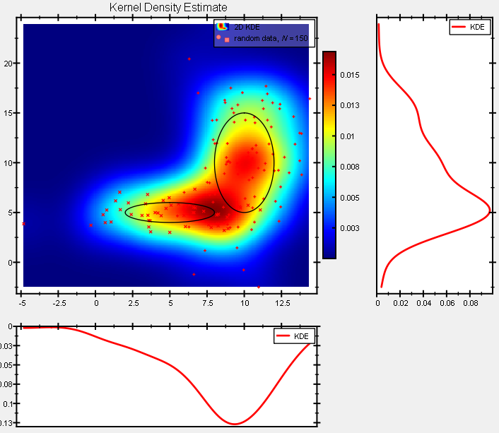
Note that calculating a KDE is a rather time-consuming task. The KDE in the image above took about 8s to calculate (from 150 datapairs and on a 193*267 pixel grid), whereas the corresponding histogram took only 1ms to calculate!
There is also an "adaptor" which significanty reduce the amount of coude you have to type (i.e. it replaces all the code above):
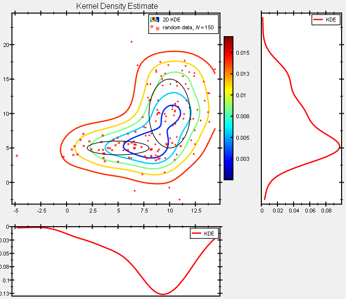
These differ in the type of plot that is added jkqtpstatAddKDE2DImage() adds an image graph (JKQTPColumnMathImage) and jkqtpstatAddKDE2DContour() adds a contour plot (JKQTPColumnContourPlot). the first is shown in the screenshot above, the latter looks like this:
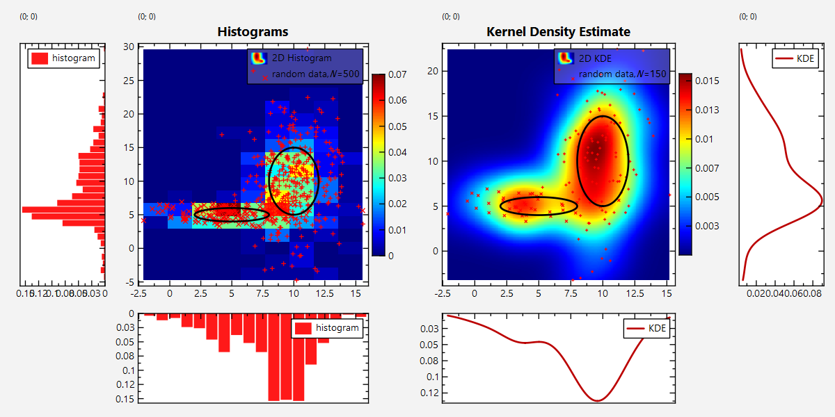
Screenshot of the full Program
The output of the full test program datastore_statistics_2d.cpp looks like this: