This tutorial project (see ./examples/datastore_groupedstat/) explains several advanced functions of JKQTPDatastore in combination with the [JKQTPlotter Statistics Library] conatined in JKQTPlotter.
Note that there are additional tutorial explaining other aspects of data mangement in JKQTPDatastore:
The source code of the main application can be found in datastore_groupedstat.cpp. This tutorial cites only parts of this code to demonstrate different ways of working with data for the graphs.
Barcharts & Boxplots from categorized data
Generating a Dataset for Grouped Barcharts
To demonstrate the grouped statistics, we first have to generate a dataset. The datapoints consist of pairs <group,value>, where the groups are encoded by the numbers 1,2,3 and in each group, several measurements are taken:
size_t colBarRawGroup=datastore1->addColumn("barchart, rawdata, group");
size_t colBarRawValue=datastore1->addColumn("barchart, rawdata, value");
datastore1->appendToColumns(colBarRawGroup, colBarRawValue, 1, 1.1);
datastore1->appendToColumns(colBarRawGroup, colBarRawValue, 1, 1.5);
datastore1->appendToColumns(colBarRawGroup, colBarRawValue, 1, 0.8);
datastore1->appendToColumns(colBarRawGroup, colBarRawValue, 2, 2.2);
datastore1->appendToColumns(colBarRawGroup, colBarRawValue, 3, 4.1);
Note that the data does not have to be sorted. You can add the dataset in any order!
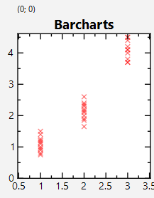
This dataset can be visualized with a simple scatter plot:
gScatterForBar->
setXYColumns(colBarRawGroup, colBarRawValue);
void setSymbolSize(double __value)
set the size (=diameter in pt) of the graph symbol (in pt)
void setSymbolColor(const QColor &__value)
set the color of the graph symbols
void setSymbolType(JKQTPGraphSymbols __value)
set the type of the graph symbol
void setXYColumns(size_t xCol, size_t yCol)
sets xColumn and yColumn at the same time
This implements xy line plots. This also alows to draw symbols at the data points.
Definition jkqtplines.h:61
void setDrawLine(bool __value)
indicates whether to draw a line or not
QColor QColorWithAlphaF(const QColor &color, qreal alphaF)
construct a QColor, based on the given color, but with alpha set to the specified value alphaF
Definition jkqtptools.h:364
The resulting plot looks like this:
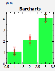
Calculating Grouped Statistics for a Barchart
Now we want to draw a barchart for every group, which indicates the average in each group. This is done using methods from the statistics library. First we need to group the data using jkqtpstatGroupData(), which assembles the data points in each group groupeddataBar
std::map<double, std::vector<double> > groupeddataBar;
datastore1->begin(colBarRawValue), datastore1->end(colBarRawValue),
groupeddataBar);
Now we can calculate the statistics for each group separately: Data is collected in new columns colBarGroup, colBarAverage and colBarStdDev. The statistics is then calculated by simply iterating over groupeddataBar and calling functions like jkqtpstatAverage() for each group:
size_t colBarGroup=datastore1->addColumn("barchart, group");
size_t colBarAverage=datastore1->addColumn("barchart, group-average");
size_t colBarStdDev=datastore1->addColumn("barchart, group-stddev");
for (auto it=groupeddataBar.begin(); it!=groupeddataBar.end(); ++it) {
datastore1->appendToColumn(colBarGroup, it->first);
datastore1->appendToColumn(colBarAverage,
jkqtpstatAverage(it->second.begin(), it->second.end()));
datastore1->appendToColumn(colBarStdDev,
jkqtpstatStdDev(it->second.begin(), it->second.end()));
}
Finally the calculated groups are drawn:
This implements a vertical bar graph with bars between and and error indicator.
Definition jkqtpbarchart.h:90
void setYErrorColumn(int __value)
the column that contains the error of the x-component of the datapoints
The resulting plot looks like this:
In order to safe yo the typing of the code above, shortcuts in the form of adaptors exist:
datastore1->begin(colBarRawGroup), datastore1->end(colBarRawGroup),
datastore1->begin(colBarRawValue), datastore1->end(colBarRawValue));
Also other flavors exist that generate different graphs (see the JKQTPlotter documentation):
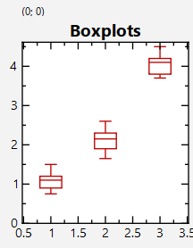
Calculating Grouped Statistics for a Boxplot
With the methods above we can also calculate more advanced statistics, like e.g. boxplots:
size_t colBarMedian=datastore1->addColumn("barchart, group-median");
size_t colBarMin=datastore1->addColumn("barchart, group-min");
size_t colBarMax=datastore1->addColumn("barchart, group-max");
size_t colBarQ25=datastore1->addColumn("barchart, group-Q25");
size_t colBarQ75=datastore1->addColumn("barchart, group-Q75");
for (auto it=groupeddataBar.begin(); it!=groupeddataBar.end(); ++it) {
datastore1->appendToColumn(colBarMedian,
jkqtpstatMedian(it->second.begin(), it->second.end()));
datastore1->appendToColumn(colBarMin,
jkqtpstatMinimum(it->second.begin(), it->second.end()));
datastore1->appendToColumn(colBarMax,
jkqtpstatMaximum(it->second.begin(), it->second.end()));
datastore1->appendToColumn(colBarQ25,
jkqtpstatQuantile(it->second.begin(), it->second.end(), 0.25));
datastore1->appendToColumn(colBarQ75,
jkqtpstatQuantile(it->second.begin(), it->second.end(), 0.75));
}
The result can be plotted using JKQTPBoxplotVerticalGraph, which receives a column for each value class of the final plot:
void setPercentile25Column(int __value)
the column that contains the 25% percentile-component of the datapoints
void setMinColumn(int __value)
the column that contains the minimum-component of the datapoints
void setPositionColumn(int __value)
the column that contains the x-component of the datapoints
void setMedianColumn(int __value)
the column that contains the median-component of the datapoints
void setMaxColumn(int __value)
the column that contains the maximum-component of the datapoints
void setPercentile75Column(int __value)
the column that contains the 75% percentile-component of the datapoints
This implements vertical boxplots, optionally also a notched boxplot.
Definition jkqtpboxplot.h:102
The resulting plot looks like this:
In order to safe yo the typing of the code above, shortcuts in the form of adaptors exist:
datastore1->begin(colBarRawGroup), datastore1->end(colBarRawGroup),
datastore1->begin(colBarRawValue), datastore1->end(colBarRawValue));
Also other flavors exist that generate different graphs (see the JKQTPlotter documentation):
(Scatter-)Graphs with X/Y-errors from Categorized Data
Dataset for XY Scatter Graphs
First we generate a second dataset, which is going to be used for a scaterplot. The datapoints consist of pairs <x,y>, that are based on a parabula with random deviations, both in x- and y-direction:
size_t colScatterRawX=datastore1->addColumn("scatterplot, rawdata, x");
size_t colScatterRawY=datastore1->addColumn("scatterplot, rawdata, y");
std::random_device rd;
std::mt19937 gen{rd()};
std::normal_distribution<> d1{0,0.5};
const size_t N=100;
const double xmax=3.5;
for (size_t i=0; i<N; i++) {
const double x=(static_cast<double>(i)-static_cast<double>(N)/2.0)*xmax/(static_cast<double>(N)/2.0);
datastore1->appendToColumns(colScatterRawX, colScatterRawY, x+d1(gen), y+d1(gen));
}
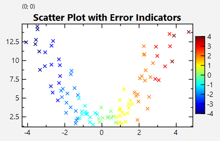
This dataset can be visualized:
This implements xy scatter plots (like JKQTPXYScatterGraph), but the color and size of the symbols ma...
Definition jkqtpscatter.h:147
void setDrawLine(bool __value)
indicates whether to draw a line or not
The resulting plot looks like this:
Calculating x- and y-Errors from Categorized Data
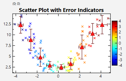
Now we want to draw a scatterchart of the data, where data-points should be grouped together, in x-intervals of width 0.5. From all the points in each interval, we calculate the in both x- and y-direction the average and standard deviation. First we need to group the data using jkqtpstatGroupData(), which assembles the data points in each group groupeddataScatter. For the custom grouping of the datapoints we use the optional functor provided to jkqtpstatGroupData(): We use jkqtpstatGroupingCustomRound1D() with given parameters 0.25 for the (center) location of the first bin and bin width 0.5. The functor is not built by hand (which would be possible using std::bind), but with the generator function jkqtpstatMakeGroupingCustomRound1D(). In addition we use a variant of jkqtpstatGroupData(), which outputs a column with the category assigned to every data pair in the input data range:
std::map<double, std::pair<std::vector<double>,std::vector<double> > > groupeddataScatter;
size_t colScatterRawGroup=datastore1->addColumn("scatterplot, rawdata, assigned-group");
datastore1->begin(colScatterRawY), datastore1->end(colScatterRawY),
datastore1->backInserter(colScatterRawGroup),
groupeddataScatter,
The column colScatterRawGroup can now be used to color the scatter graph:
void setColorColumn(int __value)
this column contains the symbol color
Now we can calculate the statistics for each group separately: Data is collected in two new columns. Then the statistics is calculated by simply iterating over groupeddataScatter and calling functions like jkqtpstatAverage() for each group:
size_t colScatterXAvg=datastore1->addColumn("scatter, x, average");
size_t colScatterXStd=datastore1->addColumn("scatter, x, stddev");
size_t colScatterYAvg=datastore1->addColumn("scatter, y, average");
size_t colScatterYStd=datastore1->addColumn("scatter, y, stddev");
for (auto it=groupeddataScatter.begin(); it!=groupeddataScatter.end(); ++it) {
datastore1->appendToColumn(colScatterXAvg,
jkqtpstatAverage(it->second.first.begin(), it->second.first.end()));
datastore1->appendToColumn(colScatterXStd,
jkqtpstatStdDev(it->second.first.begin(), it->second.first.end()));
datastore1->appendToColumn(colScatterYAvg,
jkqtpstatAverage(it->second.second.begin(), it->second.second.end()));
datastore1->appendToColumn(colScatterYStd,
jkqtpstatStdDev(it->second.second.begin(), it->second.second.end()));
}
Finally the calculated groups are drawn
void setXErrorColumn(int __value)
the column that contains the error of the x-component of the datapoints
This implements xy line plots with x and y error indicators.
Definition jkqtplines.h:112
The resulting plot looks like this:
In order to safe yo the typing of the code above, shortcuts in the form of adaptors exist:
datastore1->begin(colScatterRawX), datastore1->end(colScatterRawX),
datastore1->begin(colScatterRawY), datastore1->end(colScatterRawY),
Also other flavors exist that generate different graphs (see the JKQTPlotter documentation):
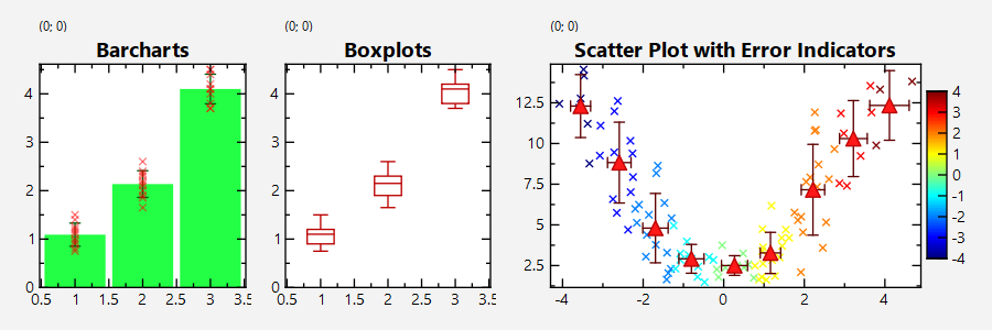
Screenshot of the full Program
The output of the full test program datastore_groupedstat.cpp looks like this: