Date Axis
This project (see ./examples/dateaxes/) simply creates a JKQTPlotter widget (as a new window) with the X-axis showing time or date(-time) values, formated as such.
The source code of the main application can be found in dateaxes.cpp.
First some data is parsed from a CSV-file (added as ressource to the example). Note that the Time/date or Date+Time data is internally stored as milliseconds since epoc (Jan 1st 1970, 00:00:00), therefore data has to be converted accordingly before beeing added to the graph.
QVector<double> date;
QVector<double> temperature, temperature_min, temperature_max;
QFile file(":/weatherdata_gelsenkirchen.csv");
file.open(QFile::ReadOnly|QFile::Text);
file.readLine();
while (!file.atEnd()) {
QString line=file.readLine();
QTextStream in(&line);
QStringList items=line.split(";");
date<<QDateTime::fromString(items[0], Qt::ISODate).toUTC().toMSecsSinceEpoch();
temperature<<items[1].toDouble();
temperature_min<<items[2].toDouble();
temperature_max<<items[3].toDouble();
}
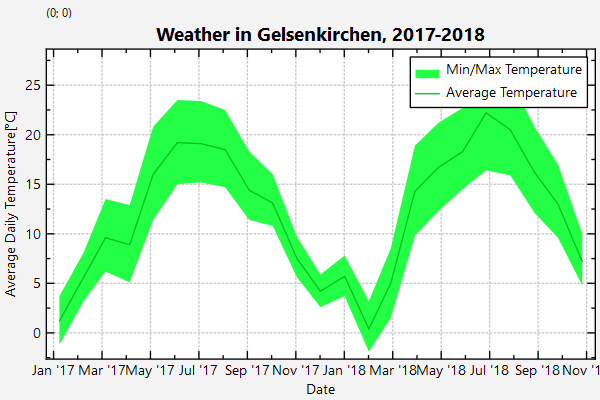
The parsed data looks like this (data was taken from http://wetter.mpg-ge.de/NOAA/NOAA-2018.txt and http://wetter.mpg-ge.de/NOAA/NOAA-2017.txt):
ISO-Date+Time;Temp_mean[degC];Temp_min[degC];Temp_max[degC]
2017-01-15T12:00; 1.2; -1.2; 3.7
2017-02-15T12:00; 5.6; 3.2; 8.1
2017-03-15T12:00; 9.6; 6.2; 13.5
...
Then two graphs are added. One of type JKQTPFilledVerticalRangeGraph plots the range of min+max temperature for each month:
size_t colDate=ds->addCopiedColumn(date, "date");
graphTemperatureRange->
setYColumn(ds->addCopiedColumn(temperature_min,
"temperature_min"));
graphTemperatureRange->
setYColumn2(ds->addCopiedColumn(temperature_max,
"temperature_max"));
graphTemperatureRange->
setFillColor(graphTemperature->getColor().lighter());
graphTemperatureRange->
setTitle(
"Min/Max Temperature");
plot.addGraph(graphTemperatureRange);
This implements filled curve plots where the area is filled between two data columns for each x-value...
Definition jkqtpfilledcurve.h:314
void setFillColor(const QColor &__value)
set the color of the graph filling
void setDrawLine(bool __value)
indicates whether to draw a line on the circumference of the described area (i.e. along the data poin...
virtual void setTitle(const QString &__value)
sets the title of the plot (for display in key!).
void setYColumn(int __value)
the column that contains the y-component of the datapoints
void setXColumn(int __value)
the column that contains the x-component of the datapoints
void setYColumn2(int __value)
the column that contains the second y-component of the datapoints
On top of that plot, a second plot is added, which draws the average temperatures of each month as a line:
size_t colDate=ds->addCopiedColumn(date, "date");
graphTemperature->
setYColumn(ds->addCopiedColumn(temperature,
"temperature"));
graphTemperature->
setTitle(
"Average Temperature");
plot.addGraph(graphTemperature);
void setLineWidth(double __value)
set the line width of the graph line (in pt)
void setSymbolSize(double __value)
set the size (=diameter in pt) of the graph symbol (in pt)
void setSymbolType(JKQTPGraphSymbols __value)
set the type of the graph symbol
This implements xy line plots with x and y error indicators.
Definition jkqtplines.h:113
Finally the x-axis is formatted to display dates (see Qt-Documentation of QDateTime::toString():
plot.getPlotter()->setPlotLabel("\\textbf{Weather in Gelsenkirchen, 2017-2018}");
plot.getXAxis()->setAxisLabel("Date");
plot.getXAxis()->setTickDateTimeFormat("MMM ''yy");
plot.getYAxis()->setAxisLabel("Average Daily Temperature [{\\degree}C]");
@ JKQTPCALTdatetime
show numbers as times
Definition jkqtptools.h:459
The result looks like this:
Time Axis
A second variant (see the example CPP-file) displays data with a time-axis:
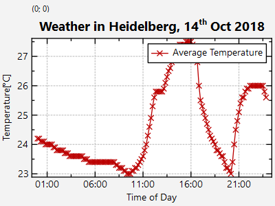
For that example data-pasring is a bit different, because the file only contains times and no dates:
QVector<double> time;
QVector<double> temperature;
QFile file(":/weatherdata_heidelberg_2018-10-14.csv");
file.open(QFile::ReadOnly|QFile::Text);
file.readLine();
while (!file.atEnd()) {
QString line=file.readLine();
QTextStream in(&line);
QStringList items=line.split(";");
time<<QDateTime::fromString("1970-01-01T"+items[0], Qt::ISODate).toUTC().toMSecsSinceEpoch();
temperature<<items[1].toDouble();
}
The parsed data looks like this:
Time; Temperature [degC]
00:00:00; 24.2
00:10:00; 24.2
00:20:00; 24.1
00:30:00; 24.1
...
Axis formating for this example is done like this:
plot.getPlotter()->setPlotLabel("\\textbf{Weather in Heidelberg, 14^{th} Oct 2018}");
plot.getXAxis()->setAxisLabel("Time of Day");
plot.getXAxis()->setTickTimeFormat("HH:mm");
plot.getYAxis()->setAxisLabel("Temperature [{\\degree}C]");
@ JKQTPCALTtime
show numbers as times
Definition jkqtptools.h:458